Seetalent.ai is a recruitment assessment platform powered by AI. The objective was to design a clean, conversion-focused marketing website that communicates the product’s value, builds trust, and encourages engagement from enterprise HR professionals and hiring teams.
Goals
To clearly communicate the value of AI-powered, bias-free assessments. Establish trust with a professional, inclusive design and drive conversions through strategically placed CTAs.
UX Strategy
We built a content hierarchy designed to guide users from discovery to action:
Hero Section: Immediate impact with a bold value prop and line-art illustration of diverse talent
Feature Highlights: Quick, scannable bullet points that support the main message
CTAs: “Talk to Us” and “Request a Demo” offered at key points in the scroll to match different user intents
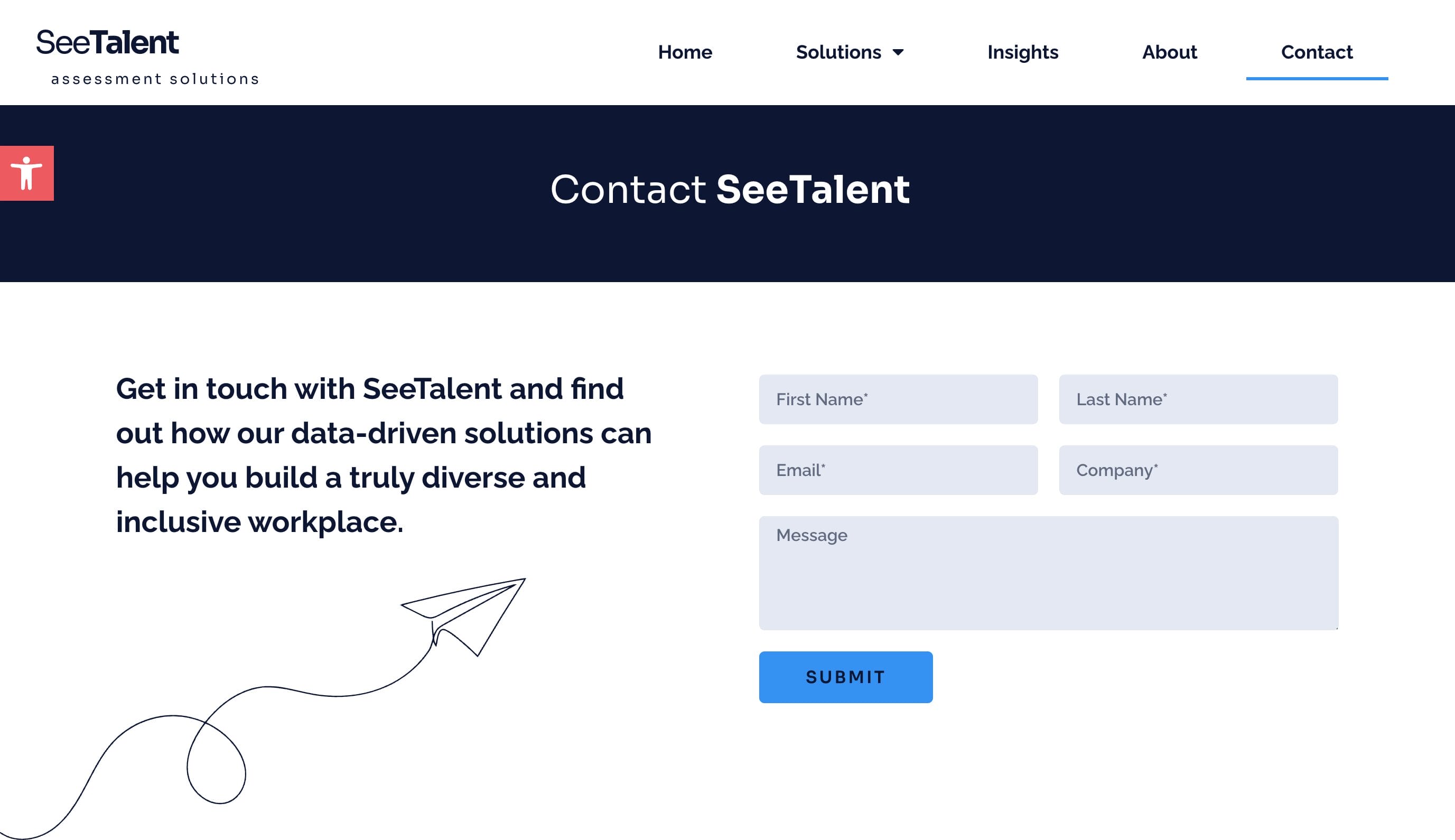
Navigation: Clean, minimal nav bar with sticky behavior for usability
UI & Visual System
Typography: Sora, a modern sans-serif font with warmth and clarity
Color Palette: Bright electric blue (#2183e6), dark blue, coral red and white for contrast and trust
Illustration Style: Minimalist line drawings humanise the brand and tie in with themes of inclusion and bias-free hiring
Layout: Responsive, grid-based sections with strong visual rhythm and white space
Conversion-Driven Design
Dual CTAs to accommodate exploratory and ready-to-convert users
Clear benefits outlined above the fold – no need to scroll to understand the value
Mobile-first adjustments ensured high performance across devices
Accessibility widget reinforces a commitment to inclusive design
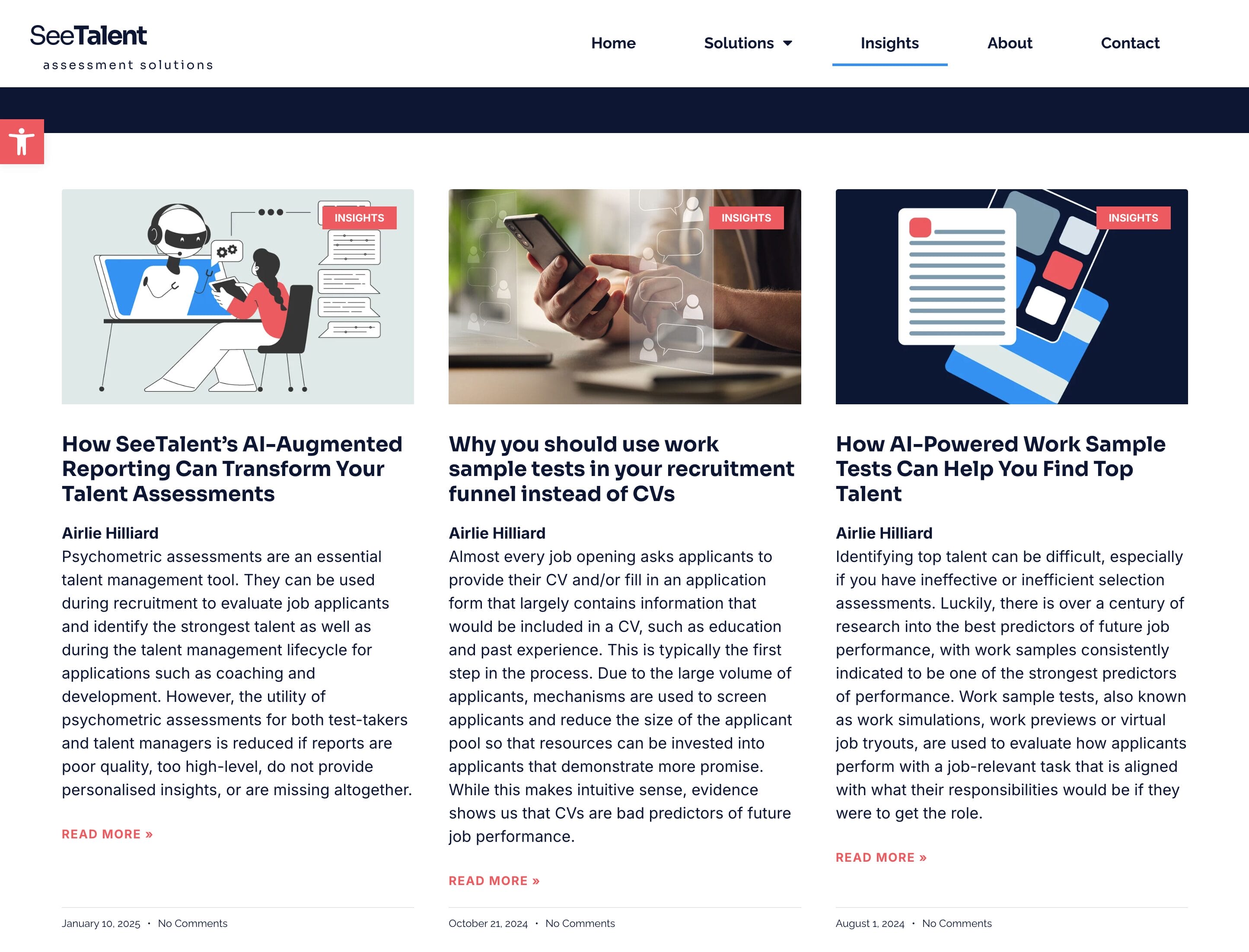
Insight Articles / Blog Page
The SeeTalent Insights blog page features a clean, modern design that prioritises readability and user engagement. The layout is minimalist, with ample white space and a consistent use of typography that aligns with SeeTalent’s branding.
Visual elements are thoughtfully integrated to complement the textual content. High-quality images and custom illustrations are used strategically to break up text and highlight key points.
These visuals are not merely decorative; they serve to reinforce the themes and messages of the posts, providing a cohesive and engaging narrative.
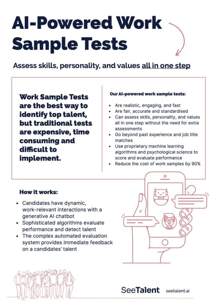
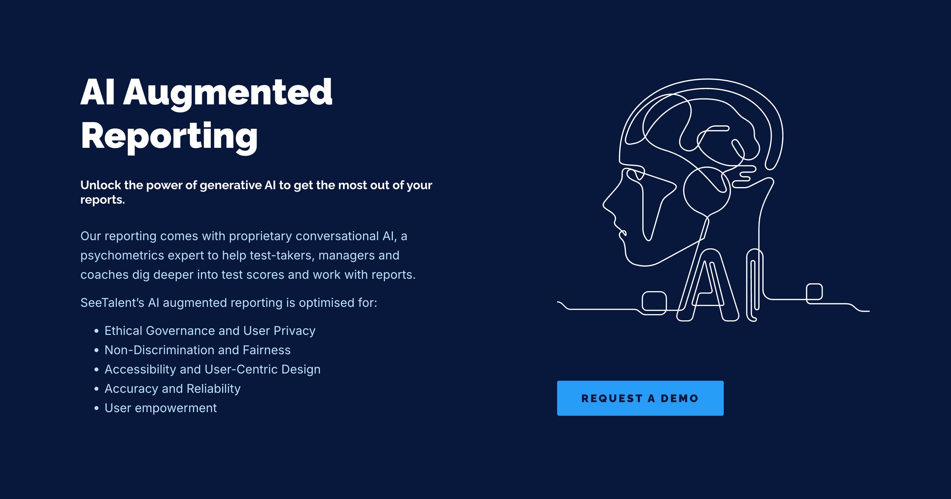
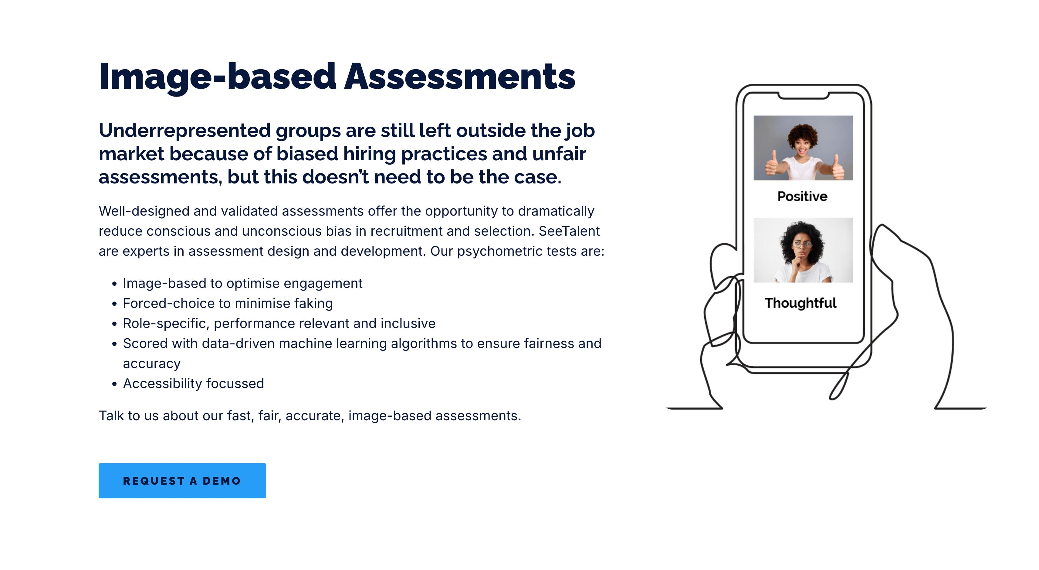
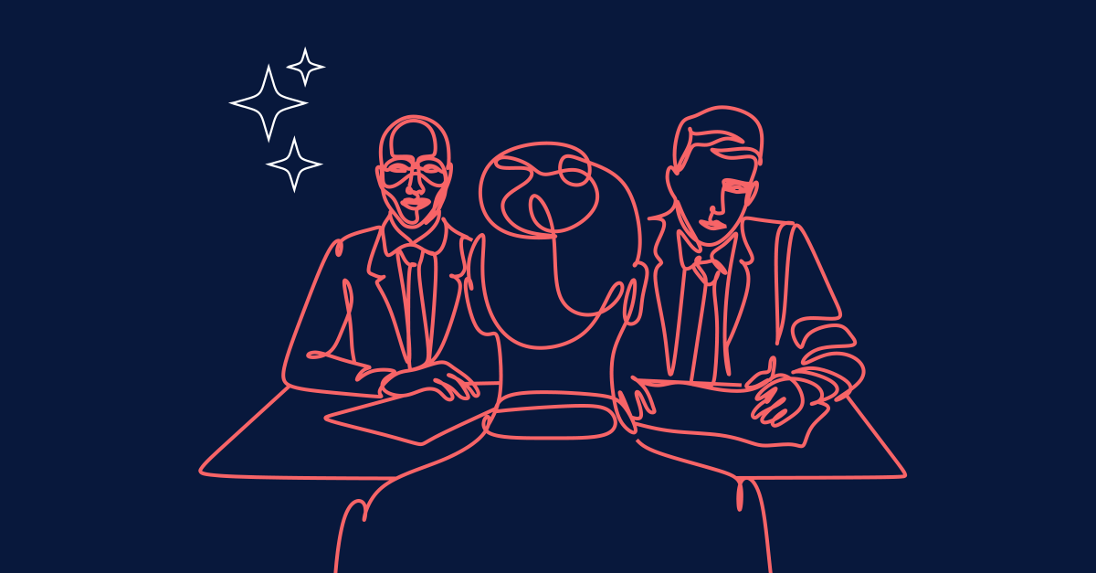
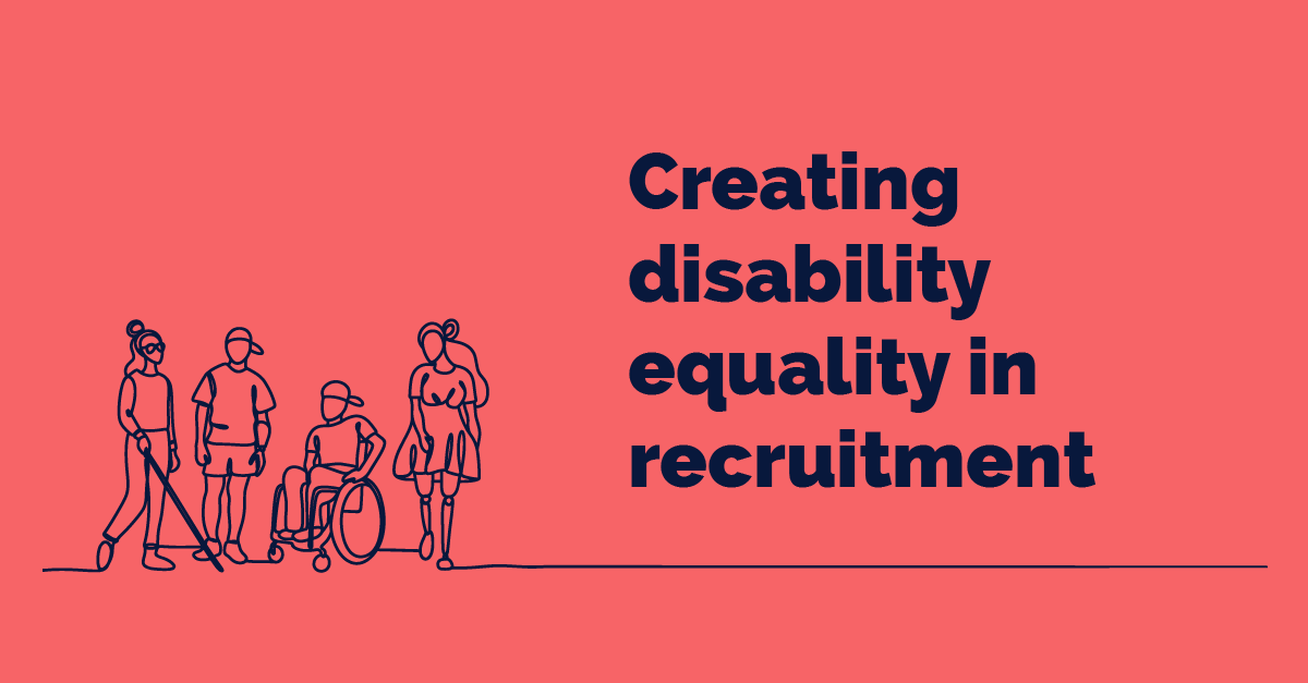
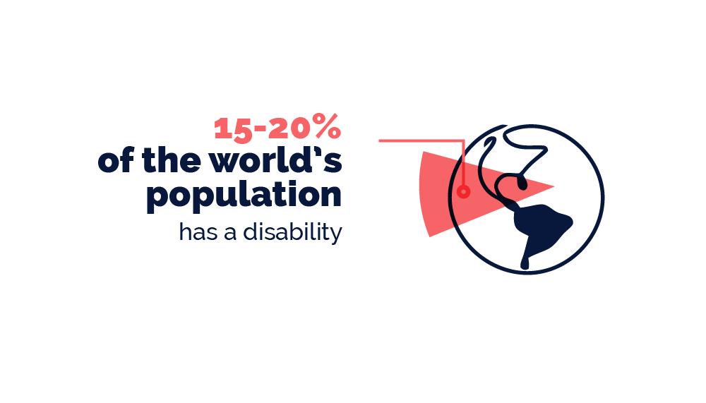
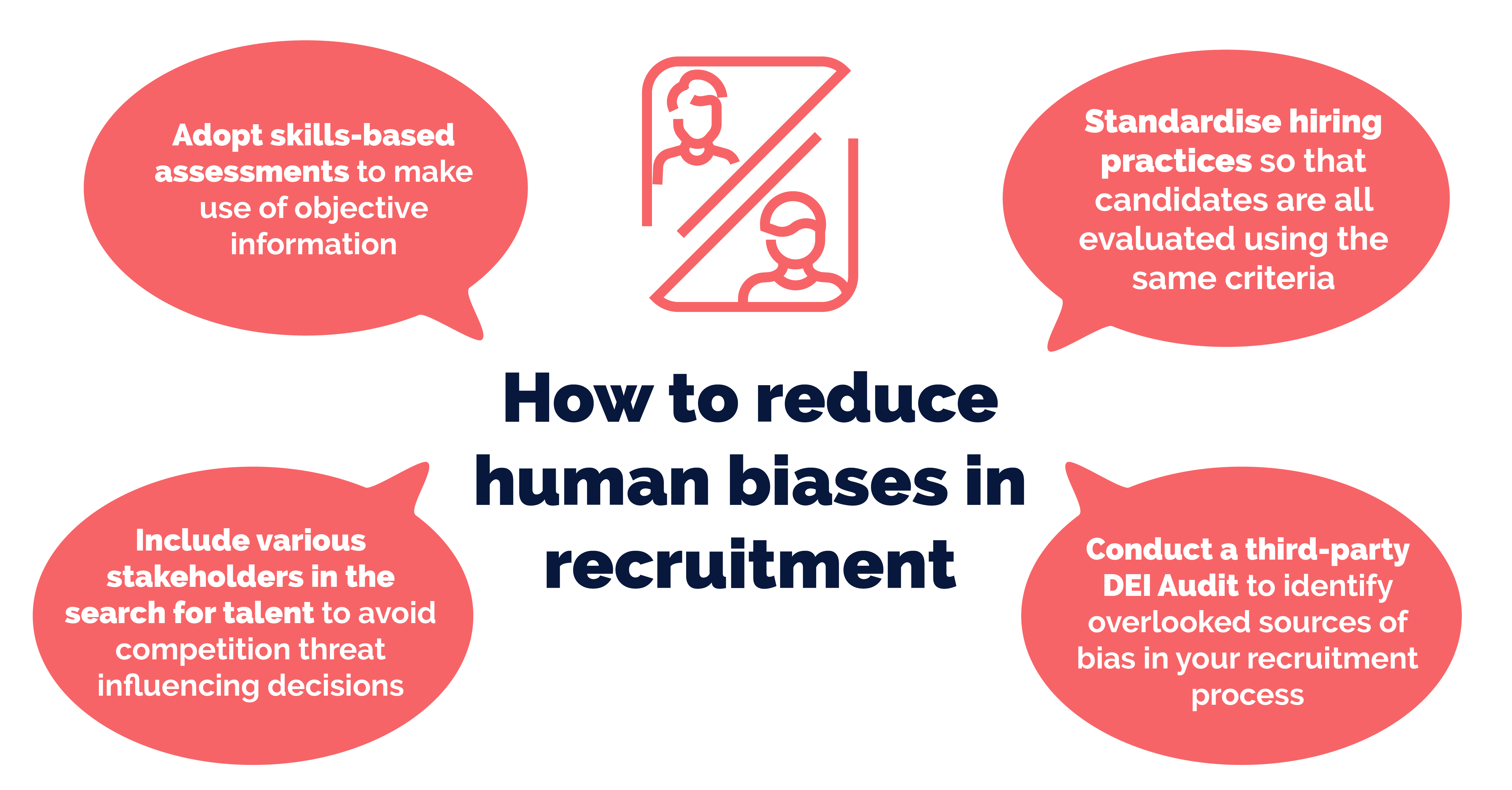
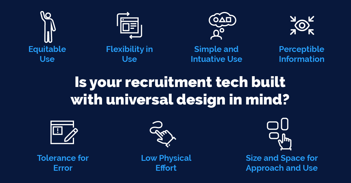
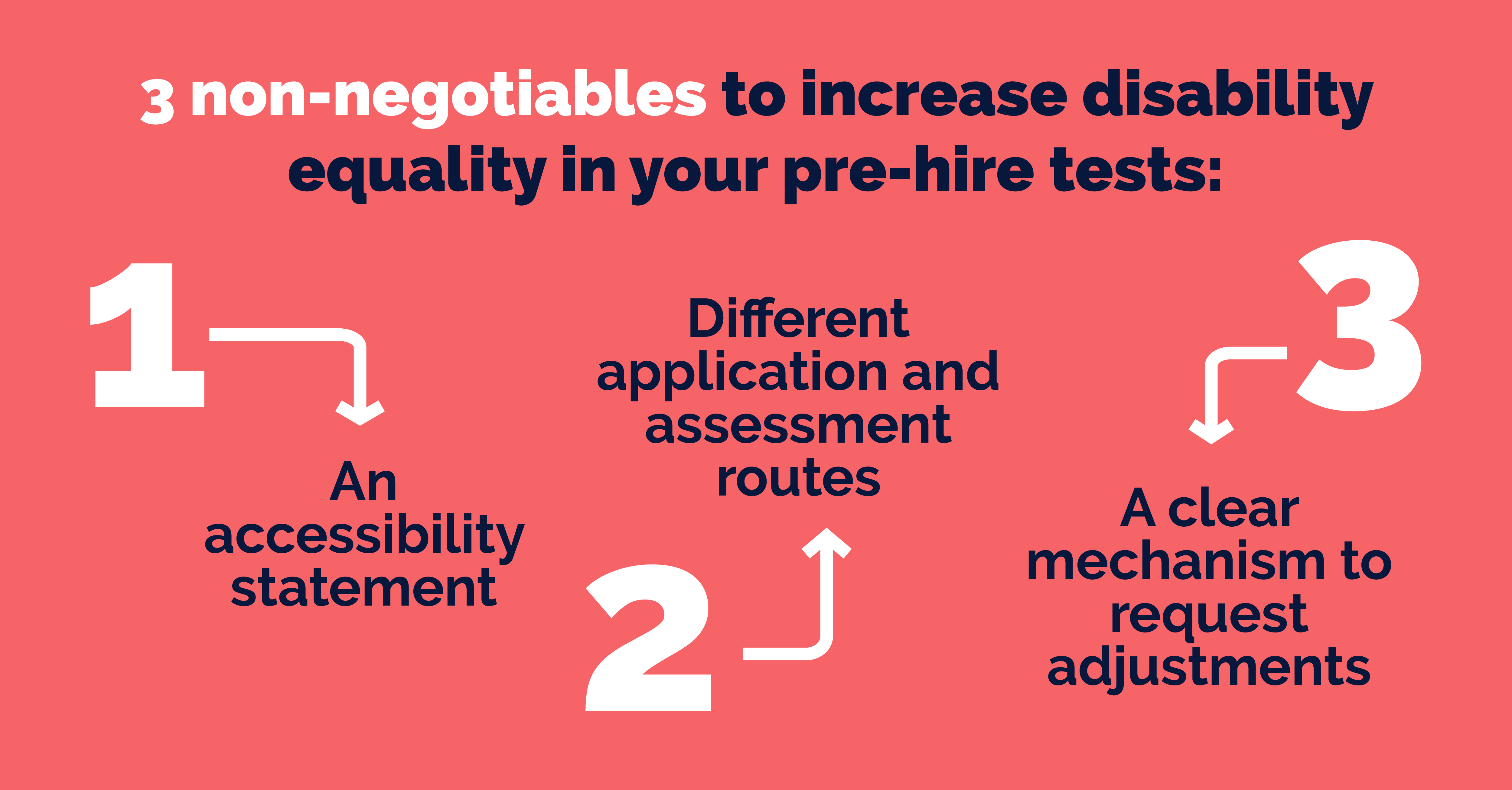
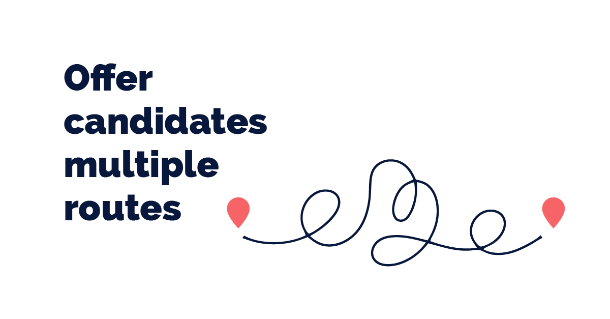
Custom Post Infographics
I used futuristic line art and clean iconography to illustrate AI concepts
The tone is designed to be professional, forward-thinking and data-literate
I created a custom icon set and line illustrations
Reusable UI cards for use cases and provided as a set of assets in PNG format, uploaded to a shared drive for easy access
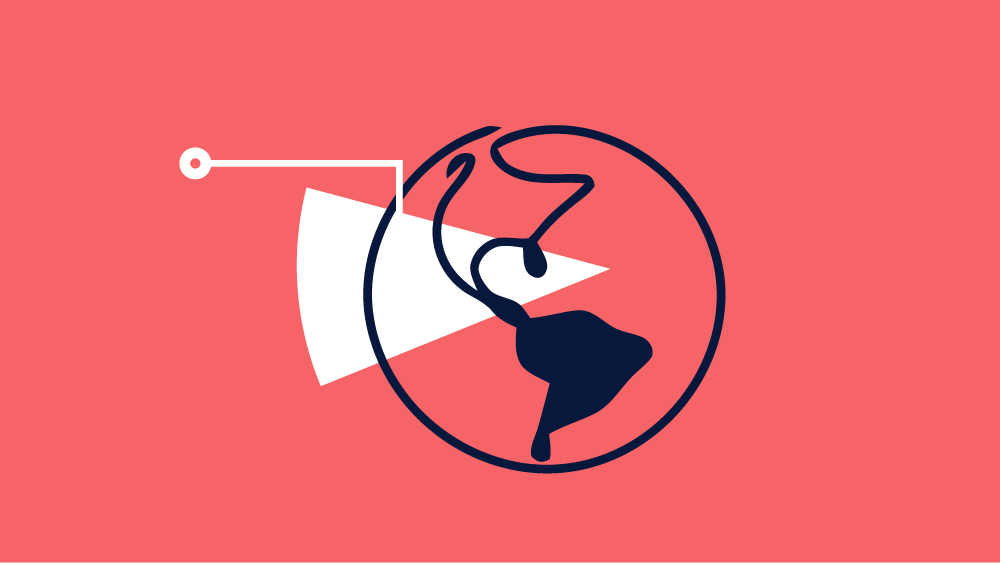
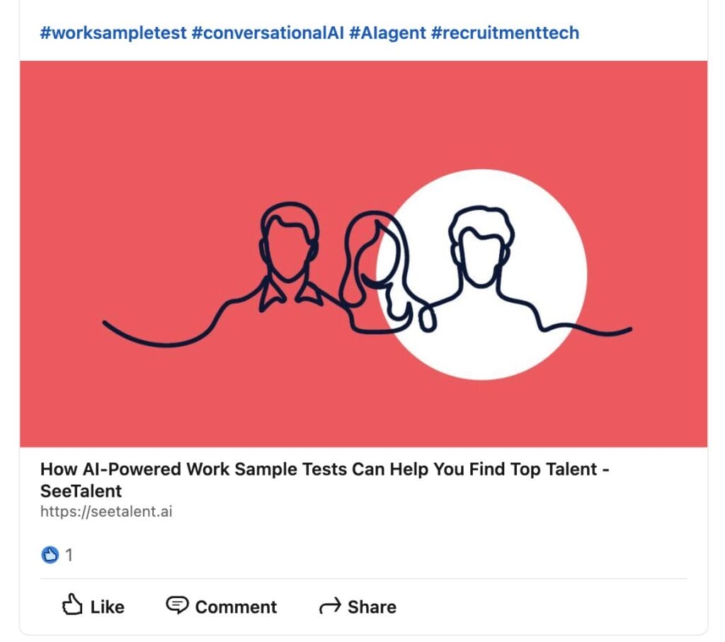
Infographic cards designed for sharing on LinkedIn
Designing infographic cards for LinkedIn calls for a clear message, strong visual impact, and formatting tailored specifically to the platform.
Graphics should be readable at a glance for users that may be scrolling quickly.
Use of bold, concise headlines to capture attention immediately.
We follow with a key stat or takeaway – something memorable and valuable.
Visual anchors are used (icon, chart, or simple illustration) to reinforce the message and add visual interest.
One-page marketing materials
I worked with the client to design one-page marketing materials to communicate a focused message quickly and effectively.
By distilling key information into a single, visually engaging page, they offer a high-impact format ideal for both digital and print distribution.
As sales enablement tools, one-pagers provide teams with a quick-reference asset that can be used during conversations, included in emails, handed out at events, or shared as a leave-behind.
These materials are designed to drive lead generation through a clear call-to-action—whether it’s booking a demo, visiting a website, or downloading a resource.
Often, they’re used alongside landing pages or outreach campaigns on platforms like LinkedIn to maximise impact.
SeeTalent Brand Identity
Visual Identity Design
As part of the SeeTalent project, I collaborated with the client on developing a new brand identity that would not only feel trustworthy and professional but also human-centric and future-forward – aligning with the platform’s mission to modernise talent assessment.
Tone of Voice: Innovative yet grounded, human yet data-driven, clear yet bold. It’s designed to appeal to both enterprise clients and HR professionals, while remaining fresh enough to stand out in a saturated HR tech landscape.
Brand Mark & Typography
The SeeTalent logotype was crafted using a dual-weight wordmark system:
“See” is set in a lighter, rounded sans-serif to convey clarity, observation, and approachability.
“Talent” is bold and confident, reflecting the brand’s core focus: identifying and empowering top talent.
This typographic contrast creates a natural visual hierarchy while maintaining simplicity and legibility across digital and print environments.
Colour System
We developed a versatile colour palette that supports accessibility, clarity and emotional resonance:
Navy Blue for authority and professionalism
Bright Coral Red to inject warmth and human energy
Sky Blue for a modern, digital-first feel
White to ensure freshness and open space in UI design
Each colourway was tested across light and dark backgrounds to ensure optimal legibility and visual balance – making the brand adaptable across multiple touchpoints, including social media and marketing campaigns.
Modular Lockups for Scalability
To support use in varied contexts, the identity includes:
A core logotype for standalone brand moments
A tagline variation (“assessment solutions”) for formal or descriptive use cases
Responsive sizing and contrast-adaptable versions for web, app and print consistency
